Impermanence · the studio
Plan a print
Photograph a drawing and it works out the colours, the size and the printing order, then prints the sheets you take to the bench.
A worked example
One drawing, four blocks
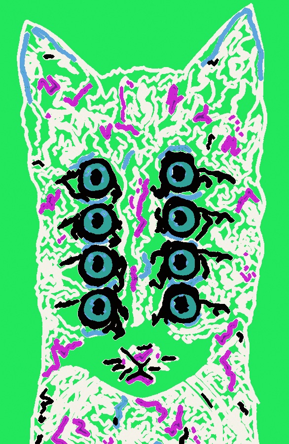
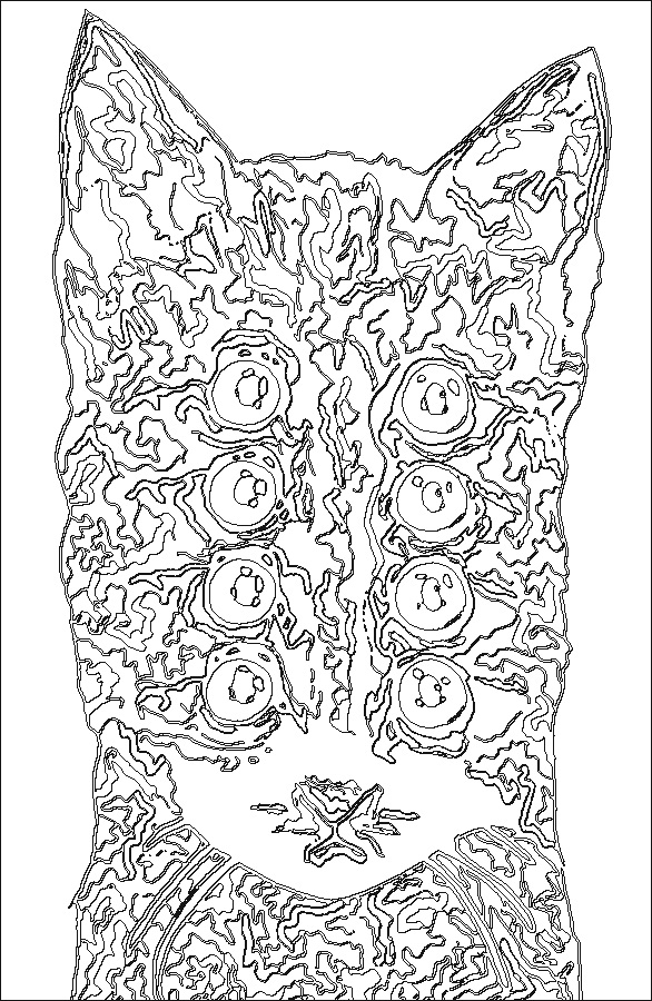
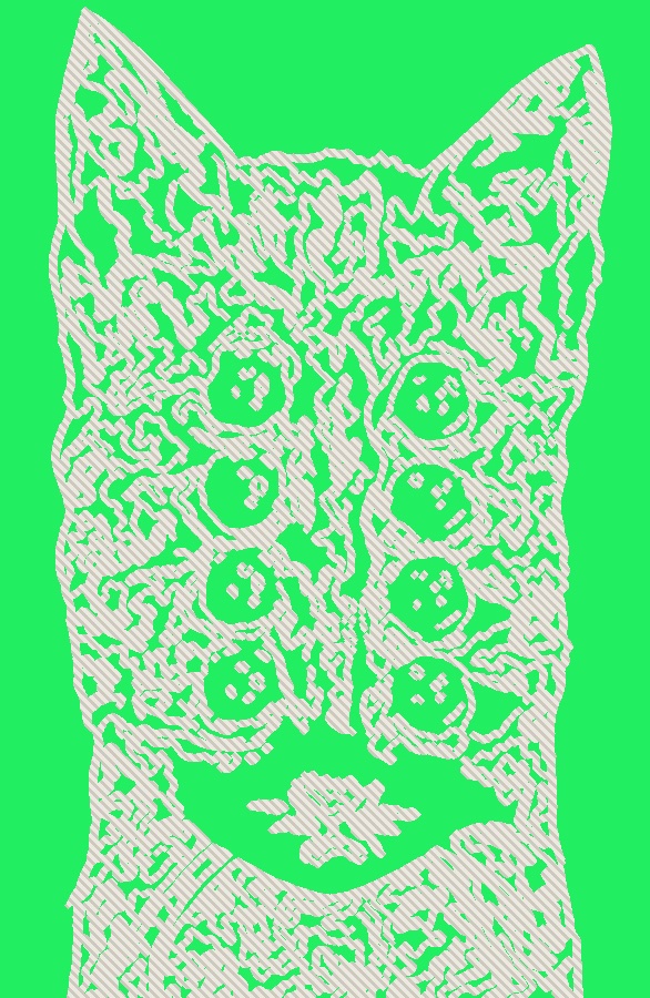
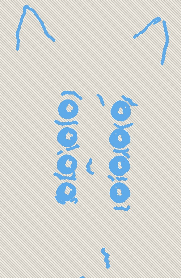
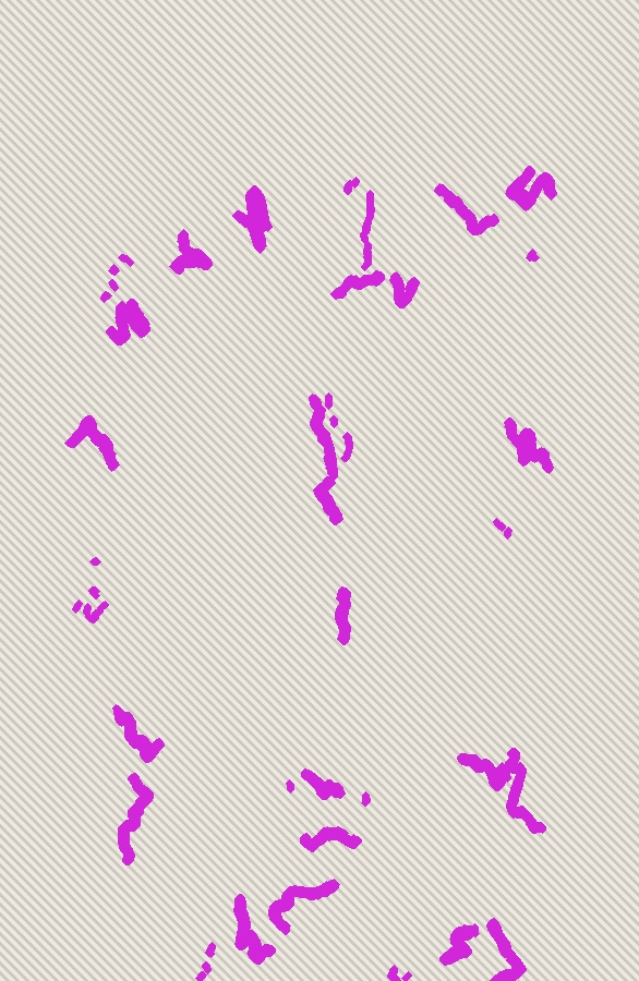
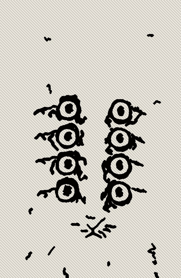
A cat taken through the studio and separated into four colours, printed lightest to darkest. These are the actual sheets it gives you — the tracing outline comes out mirrored, and each block map shows what still prints and what has been cleared.
The studio
Plan a print
A tool I built for my own work, and left open for anyone else's. Photograph a drawing and it works out which colours to separate it into, how big it has to be before the fine detail stops being cuttable, what ink to mix so the colours land right, and what order to print them in — then gives you the sheets to take to the bench. Everything happens in your browser; nothing you load is ever uploaded.
Sorting the colours works the same way for all three processes. What changes is how you make the thing that holds the ink.
Question one
Which colours?
Your drawing gets sorted into a handful of flat colours, grouped the way your eye would group them. Then you fix it by hand — join two together, drop one, change it, or paint a shape into the colour you meant.
Question two
How big?
Size isn't a matter of taste. Shrink the picture and the fine details shrink too, until they're smaller than your smallest tool. It finds the tiniest piece in your design and tells you the size where it stops being a problem.
Question three
What will the ink do?
You can see through printing ink. Every colour is tinted by whatever is already on the paper, which is why prints so often come out muddy. This tells you the colour to actually mix so it lands right.
Four things, in order
Photographed a drawing on your bed with the flash on? It finds the page, straightens it, drops the room and evens out the light, so a bright patch isn't mistaken for a colour.
Two to seven colours, and every one is yours to change — join them, recolour them, drop them, or paint a shape into the colour it should have been.
It tells you the smallest detail in millimetres, the smallest size that still works, what to buy, how much ink to put out and how long the whole thing will take.
A tracing sheet, a registration guide and one map per colour, all at actual size, each saying what to cut and what to mix. Flipped back-to-front automatically where your process needs it.
Why it works this way
The thinking behind the tool, for when you want it. None of this is needed to use the thing — every screen has an i button that says the same in one line.
Ink is see-through, and that changes everything
Printing ink isn't paint. Put yellow over blue and you get green, not yellow — the colour underneath shows through and tints whatever you lay on top.
Two things follow. First, you print light to dark and never back: a pale colour can't hide a dark one, so it simply disappears. Second, if you mix each colour to look right in the tin, it won't look right on the paper. So the tool works backwards from the colour you want on the finished print, through everything already printed, to the colour you should actually mix. That's why the recipe often looks too light — it's meant to.
Size is decided by your smallest tool
When you shrink a picture, every detail shrinks with it. A line that looks delicate on your drawing becomes a sliver of lino too thin to survive being cut, or a gap too fine to hold ink.
So the tool hunts through your design for the smallest piece anywhere in it, measures how wide that piece would be at the size you've chosen, and compares it to the smallest tool you said you'd use. If they're fighting, it tells you the size where they stop. Roughly a millimetre for lino, a tenth of that for etching.
A photo of a drawing is never flat
Point a phone at a sheet of paper and the flash makes one corner brighter than the other, the page sits at an angle, and the table is in shot. That unevenness is often bigger than the difference between your pencil and your paper — so anything sorting by colour gets it hopelessly wrong.
Before anything else, the tool finds the edges of your page, straightens it out, throws away the room, and evens out the lighting across the sheet. It matters more than any other setting here.
Blank paper will eat your colours
On a drawing, the paper can be four fifths of the picture. Sort that by colour and you'll get two near-identical whites and almost nothing left for the drawing itself.
So the paper gets set aside as simply blank, and your colours all go where the drawing is. Pencil lines get the same treatment for the opposite reason: they're thin and dark, and if you don't give them a colour of their own they dissolve into the nearest grey.
Cutting one block is a one-way street
The quickest way to print several colours is to keep cutting the same block back: print, cut more away, print again. It's cheap and the colours line up perfectly, because it's the same block every time.
But you can only ever remove material. Once you've cut away the part holding a colour, that colour is gone for good — so the whole edition has to be printed at every stage, before you pick the tool back up. Three good prints is not an edition.
The computer can't see what you meant
It can only sort by colour. It can't know that a scribbled circle is meant to be a solid shape, that a smudge isn't part of the drawing, or that a shadow should just go away.
That's why there's a brush. Everything the tool works out is a starting point you're supposed to argue with — and everything downstream, the size, the mixes, the printed sheets, rebuilds around whatever you change.
Notes from the bench
Printmaking is mostly learned by ruining things. These are the five places a first edition usually goes wrong — each one paired with the part of this tool that heads it off.
About the name
Each piece is a snapshot of perception: time taken to observe something that was close at the time, and then let go. The materials will not last and neither will the state of mind — but the way it was seen that week stays on the paper.
No account, no upload
Everything happens on this page. Your artwork never leaves your browser, and it keeps working with the wifi off.
Keep your blocks
It sets you up with one block, plate or screen per colour, so you keep the whole set. You can reprint the edition years later, or use a single block again in a different print. Reduction — cutting one block away as you go — is there if you want it, with the warning it deserves.
Real materials
Colours are matched to tubes you can buy — Caligo, Charbonnel, Permaset. Blocks, plates, frames and papers are real UK sizes.